Flatplan
The newly developed Flatplan module is a new companion for the complete lifecycle of a document. From work preparation, content assignment and document creation to correction, approval and final data dispatch.
1 Flatplan Overview
The Flatplan Overview is the first view shown for Flatplan.
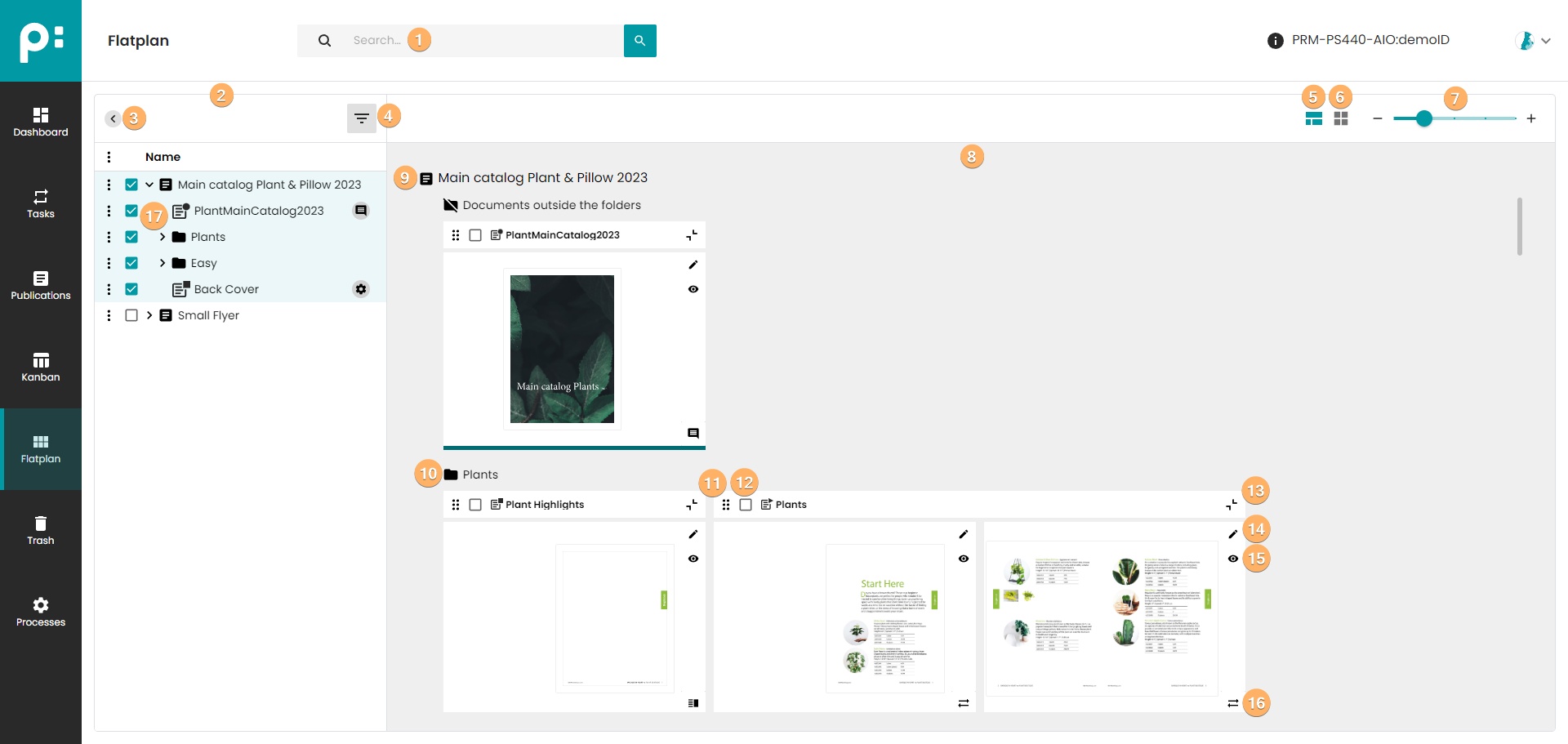
- The search field filters the publications by name with the given string.
- The left pane shows the publications found by the search as a tree. Publications and folders can be unfolded.
- The
 button hides and uncover the panel.
 - This is a filter for the document stages. Only documents in the selected stages are displayed.
- Normal mode show documents preview.
- The collapse all documents button changes the gallery view and displays the documents in a condensed version.
- The zoom control allows the user to change the zoom via changing the column number.
- In this gallery the spreads and pages of all selected documents are shown.
- Publication name header.
- Folder name header.
- An element that allows user to change the document sort.
- Selection button allows user to select multiple document.
- The
 button collapses and un-collapses documents.
 - The document stage editor is opened by this button.
- The document stage viewer is opened by this button.
- The symbol shows the current stage of the document. After clicking on the symbol, the stage of the document can be changed.
- Publications, folders, and documents can be selected. Selecting a publication or folder will automatically select all its elements. Only one publication can be selected at a time. Therefore, when user select another publication (folder or document from another publication), the selection automatically jumps to the newly selected publication.
Document Previews in Overview:
- The "best current preview" of the document pages is shown dependent on the document stage
- Preparation - The Document Template Metadata Preview combined with "Page Template Preview" is shown if the base is a "document template (master document)". If the base is a "source document" only show "Metadata Preview" of the source document
- Content Assignment - The "Grid Preview" for a static document and the "Document-Metadata-Preview" for a dynamic document is shown
- Layout - The "Document-Templete Metadata-Preview" is shown. If the document has been rendered the "Document-Metadata-Preview" is shown
- Review - The "Document-Templete Metadata-Preview" is shown
- Finishing - The "Document-Templete Metadata-Preview" is shown
- Delivery - The "Document-Templete Metadata-Preview" is shown
2 Flatplan Document Window in Every Stage
All stages contain the stage chain, a toolbar for changing the stage. The six stages are shown as six circle buttons in the defined order. The current document stage is highlighted in the main color. The circle is filled with the main color if the stage tool panel is open. If the panel is closed, the circle is not filled by the color, but the outline is colored. Click on the circle button of any stage to set this stage. Click on the circle button of the current stage to toggle between showing the tool panel or not.

Left of the stage chain there is the button  for leaving document stage and going back to the overview.
The left part of every document stage window shows all pages. The button can hide and show the pages. If the document or its pages have assigned page templates, the elements of the page template are displayed as grey frames on the pages.
Right of the page overview, the middle pane depends on the specific stage. There is one common button  , which starts a process. The zoom control allows the user to check the current work on the document in detail.
3 Flatplan Preparation Stage
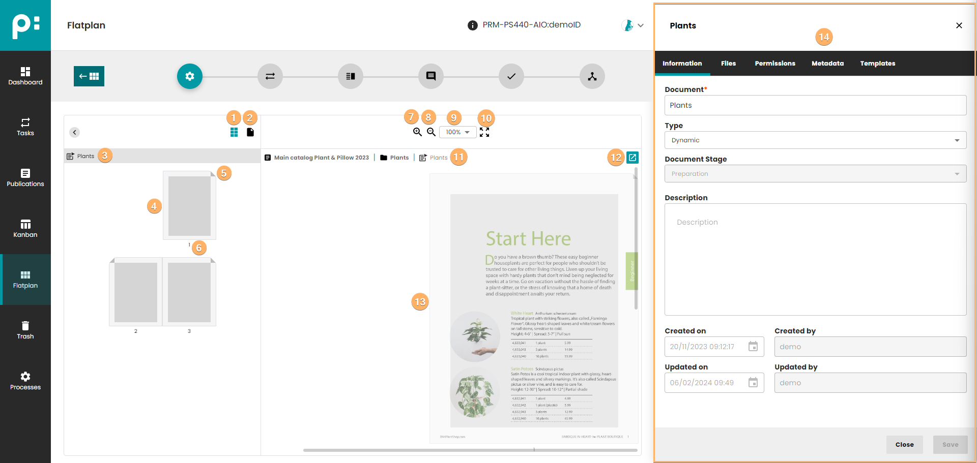
- A button that hides or shows a preview of the page template elements for a given page.
- A button that hides or shows a preview of the spread for a given page.
- Document name header.
- Page preview.
- Corner indicating page side (right/left/unisex).
- Page number.
- Zoom in button.
- Zoom out button.
- Select when user can select zoom value from list.
- Quick switch zoom to 100%.
- A breadcrumb containing the path to the document. In the path, in the first position, there is a publication name. Next you can find the folders and the document name.
- Start process button.
- Page preview. To set the page template, use drag and drop from the templates list. This list is available in the "Templates" tab.
- In the Preparation Tool Panel, the user should set all required (meta)data. The panel is the same as the document detail panel in window Publications.
Changing to next stage, Assign Content, requires that the document type is not set to Undefined.
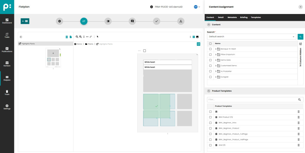
4 Flatplan Content Assignment Stage
The stage behavior depends on the document type. Dynamic documents (List Planning) and static documents (Grid Planning) are supported.
4.1 Dynamic Documents – List Planning
- Middle pane displays the plannings in a list.
- The field filters the planning. All plannings are shown which contain the filter text.
- The symbol
<list planning>denotes the list planning. - The context menu contains the commands (remove template/remove planning/remove snippet/start process) for single planning.
- The context menu contains the command remove selected plannings.
- The field Product template is a drop-down where the user can select the product template. If the user hovers the field, a red cross appears. Clicking it removes the product template.
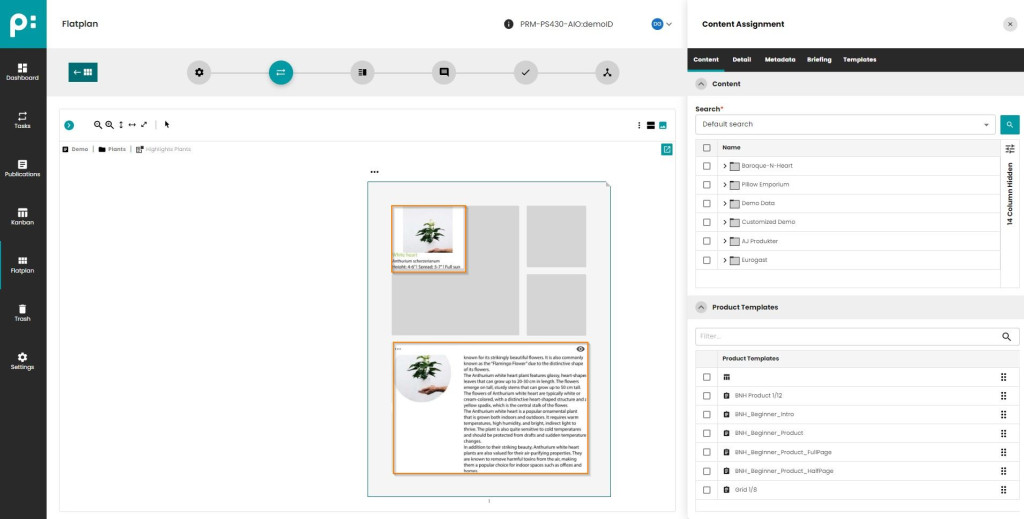
- The tab Content contains two parts (in this example), content, and templates. Both parts can be folded and unfolded with the angle buttons.
- Content panel.
- The default search field, filters the root level. It is possible to prepare your own search engine.
- Content list shows the data from publishing:hub. For planning a single bucket drag it and drop it into the position needed in the list planning. Several plannings can be created in selecting the buckets via the checkbox in content tree (shift selection is also available), and then drag and drop them together into the planning list. No need to click save, plannings are saved automatically.
- Product template panel.
- The search field filters, while typing into it, the templates by their names.
- The part Templates of the tab Content shows the product templates linked to the publication or folder. The product template can be set for plannings by drag and drop as well. If plannings are selected (checkbox on planning list) and the user drops a template on any selected plannings, all selected plannings get the template. This is a quick way to set templates for many plannings.
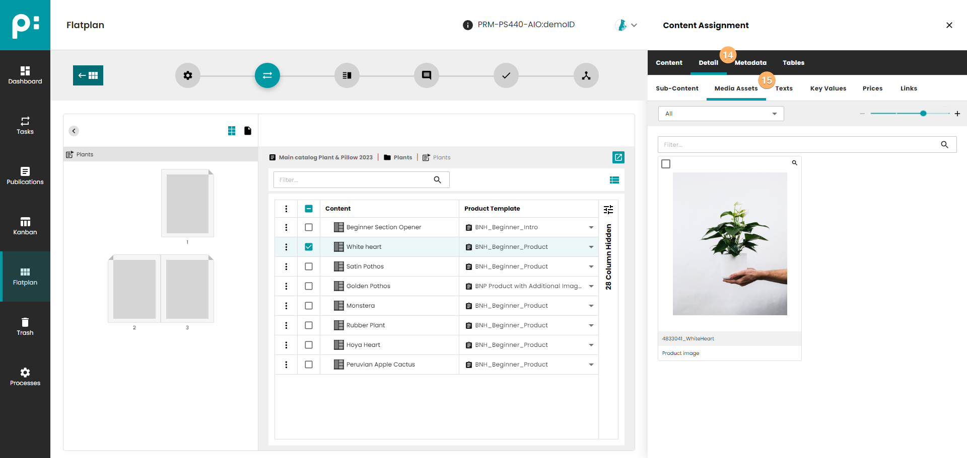
- The tab Detail is used for creating sub-plannings or defining which parts of a selected bucket are shown in this document. The tab Detail requires the user to select a single planning in the planning list. For example, if the planned product has several product images, the user can define which of them should be shown. Please be aware that the selected template must contain special provisions for this to work as expected. It is possible to configure the detail tabs that are shown for a template. You have to configure special Tags for the Template. See the Documentation about how to configure templates for this Smart Detail Panel.
- The sub-tab Sub-Content lists the sub-buckets of the planned bucket. The sub-tabs Sub-Content, Texts, Key Values, Prices, and Links work in a similar way. Selecting an entity in the drop-down filters the detail list, as does the search field. The sub-tab Media Assets for the images contains additionally a control for zooming, and a function to show the image in large.
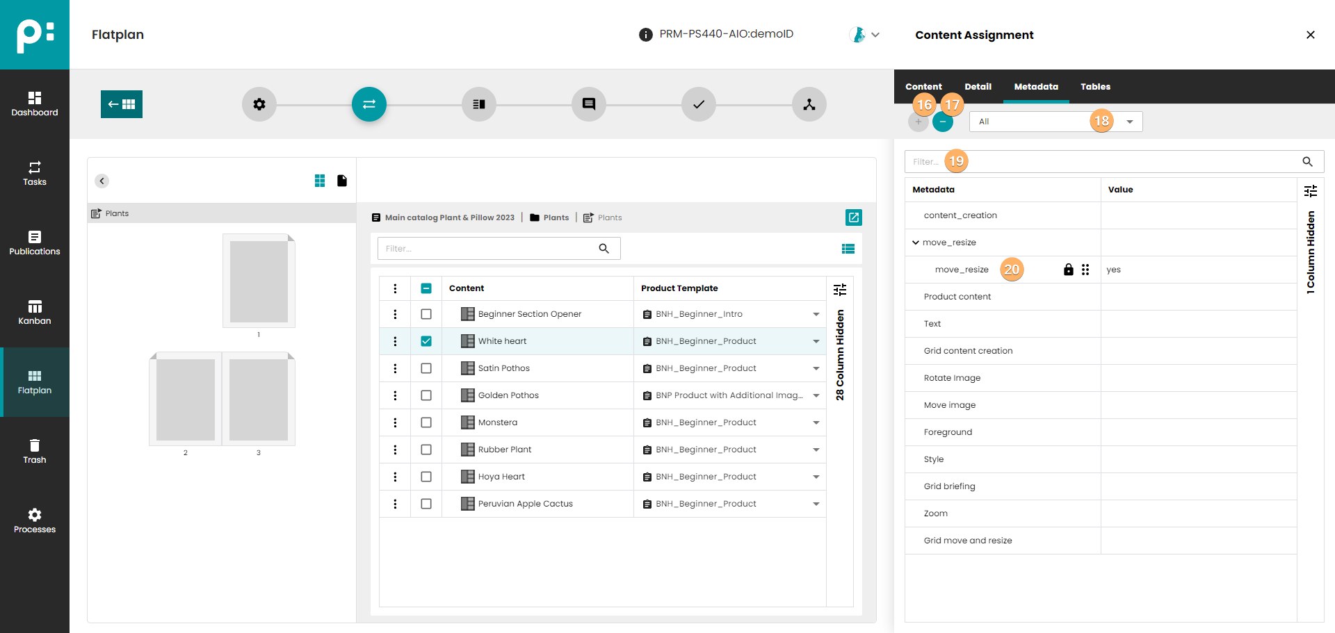
- The + button creates a new metadata record. It is enables after the user selected one of the listed metadata entities by click.
- The – button deletes a meta data record. It is enabled after the user selected a metadata record by click.
- The drop-down filters the metadata list by the selected root level metadata entity.
- The search field filters the metadata records by the key.
- An existing metadata record can be edited. Activate editing the value by double click. Activate editing the key by clicking of the key symbol. The order of records of the same entity can be changed by drag and drop.
All changes are automatically saved.
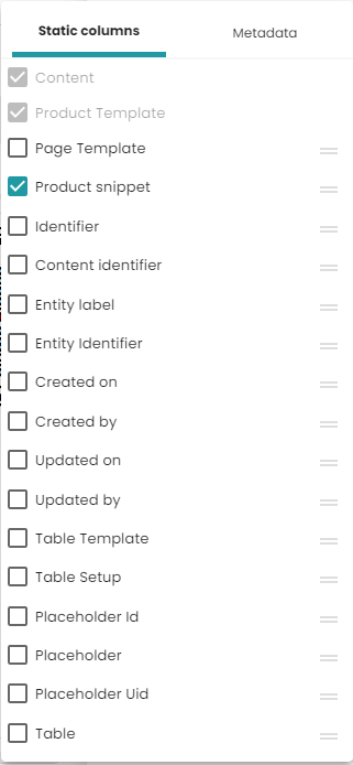
4.1.1 Planning columns
In the planning list, in the upper right corner there is an icon  which contains possible columns to display. These columns are divided into two sections:
- standard columns - these are columns closely related to planning
- metadata - columns of metadata assigned to planning
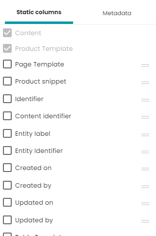
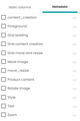
Thanks to this solution, you can see all interesting information in one place on the grid.
If some metadata has more than one value, only the first one will be displayed in the grid. Metadata can be changed directly in the planning list.
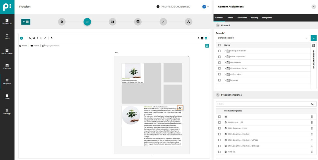
4.2 Static Documents – Grid Planning
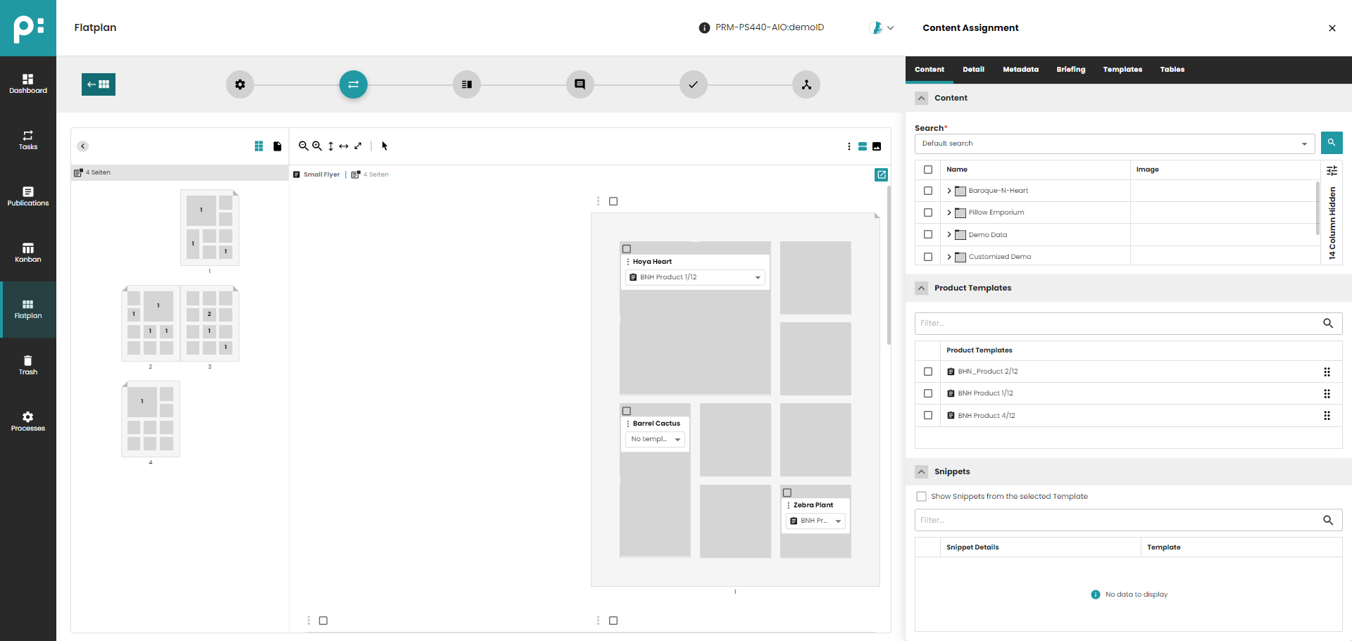
- "Grid Planning" shows planned Content in a Grid
- Content can be added using Drag & Drop
4.2.1 Basic Perspective
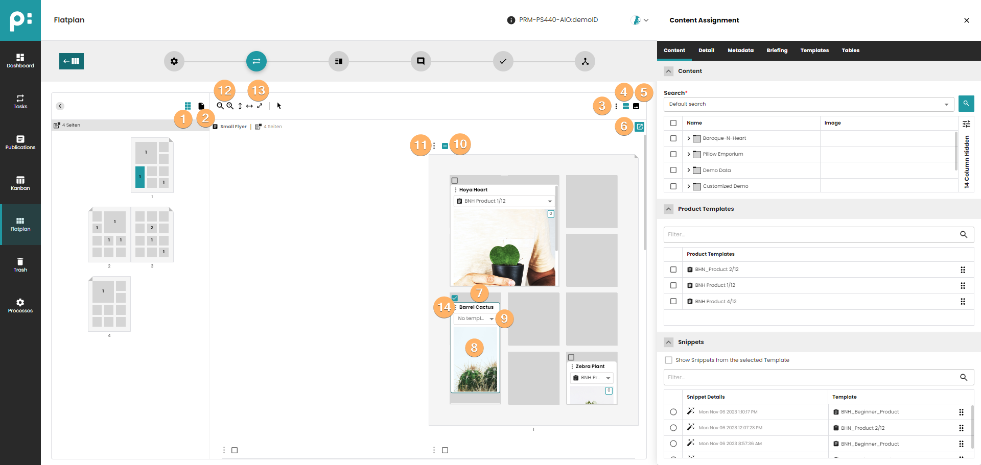
- Show/Hide Page Elements in Sidebar
- Show/Hide Page Previews in Sidebar
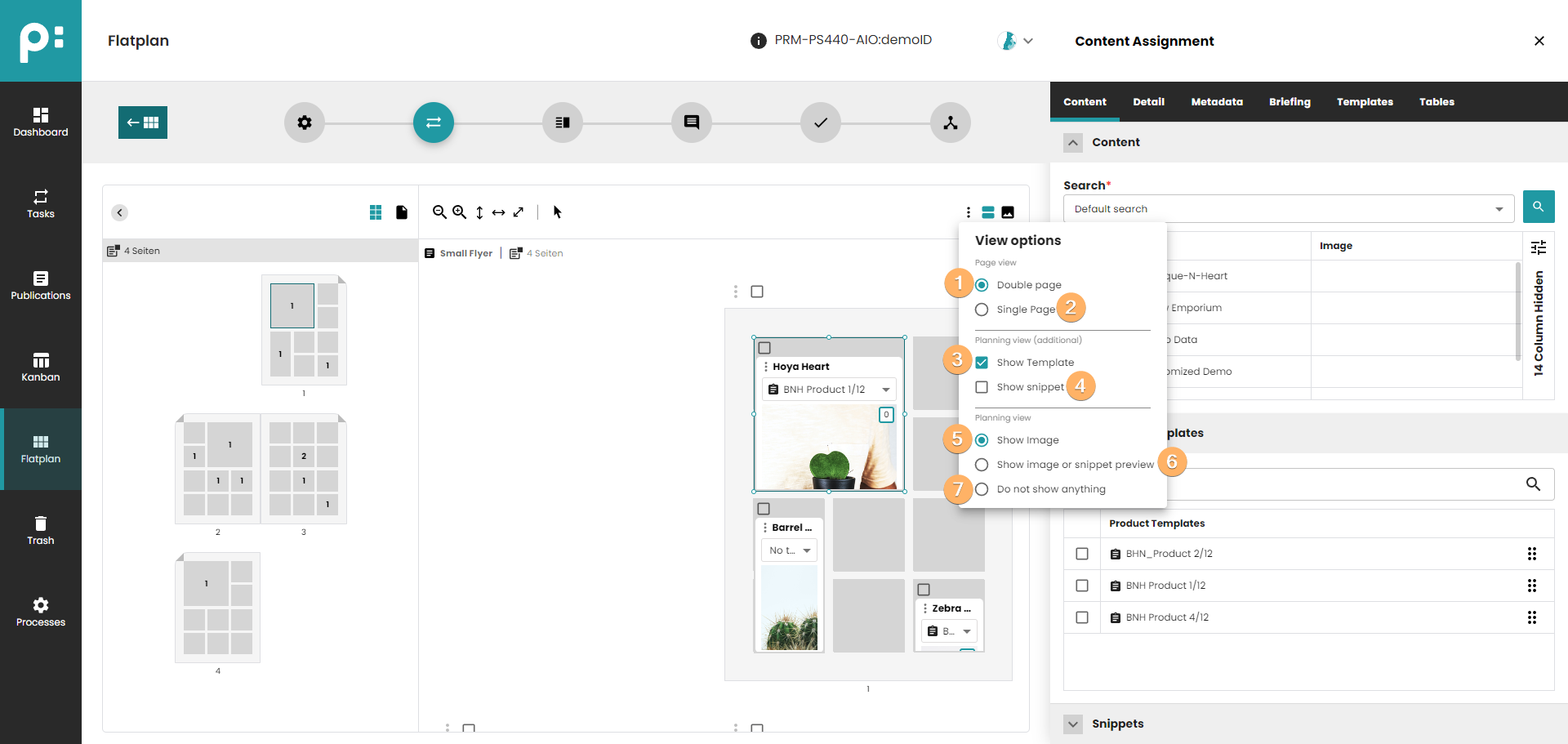
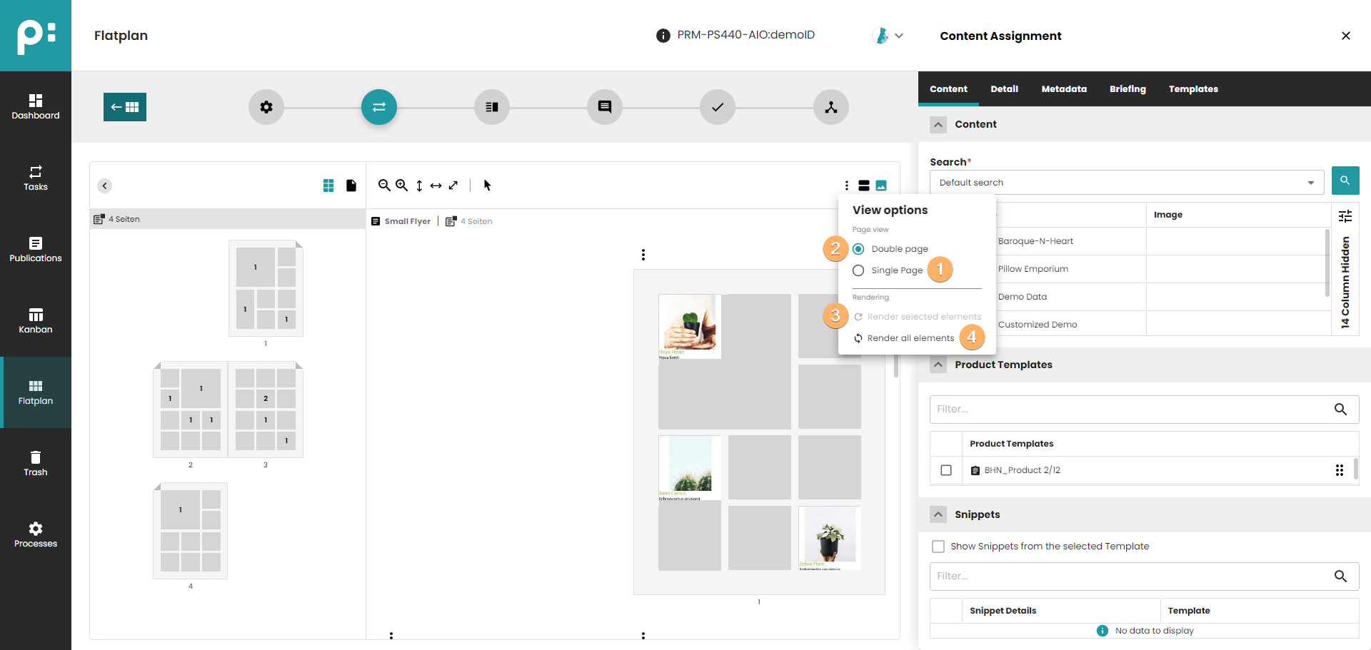
- Global Context Menu to Change the View Options (options are saved for the user for the next sessions in the same browser):
- Single Page - all pages are displayed one under another (multiple page spreads are divided into pages);
- Double Page - standard view with double pages;
- Show Template - show the Product Template dropdown on each planning;
- Show Snippet - show the Product Snippet field on each planning;
- Show Image - show the main image of the Planning (if any);
- Show Image or Snippet preview - show the main image of the Planning or the preview of the Snippet (if any). If the Snippet is assigned, its preview will always be shown.
- Do not show anything (no preview will be displayed);
- Button enabled if in "Basic Perspective"
- Button to switch to "Print Perspective"
- Button to run Camunda process
- Grid Element
- Planning
- Template Selection of Planning
- Select all Plannings on a Page
- Context Menu of Page, currently only Deleting of all selected Plannings is possible using this Context Menu
- Zoom-In and Zoom-Out the Page/Spread
- Fit Spread/Page to Width, to Height or to Both
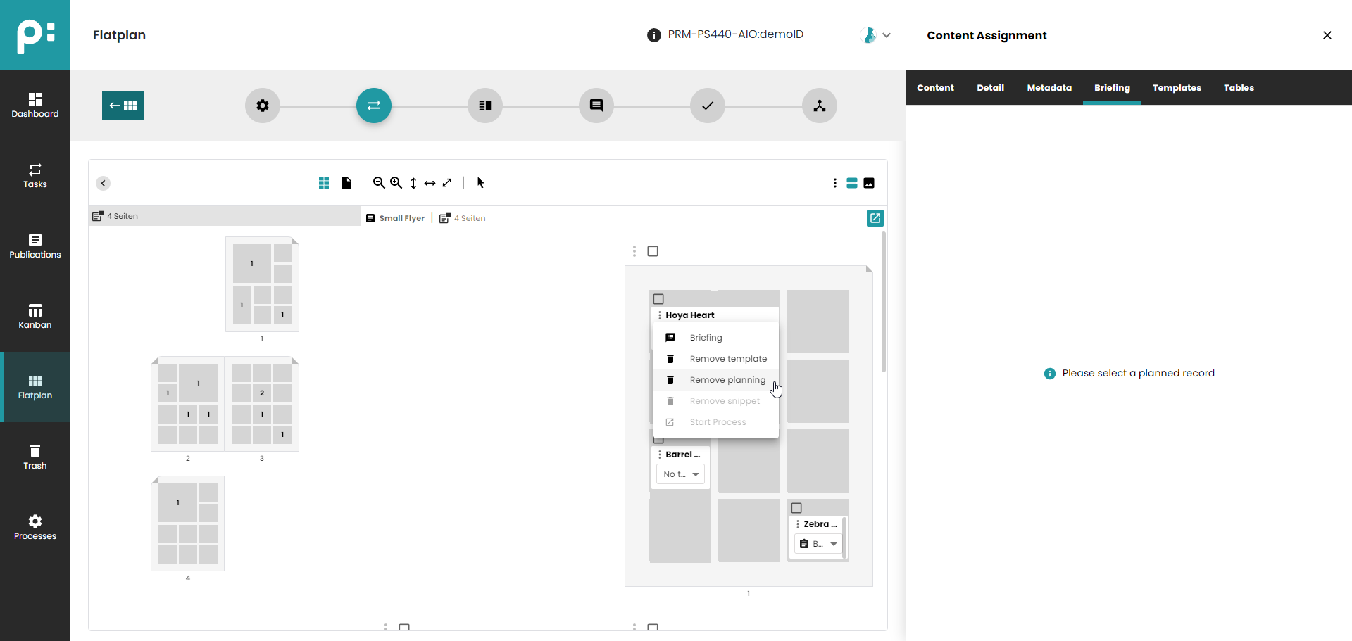
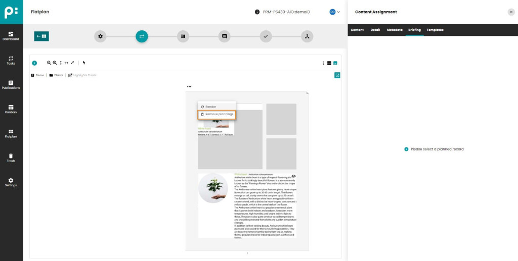
- Context menu of the Planning. The following options are available:
- Briefing - open the Briefing text tab for the Planning
- Remove template - remove Product Template assignment
- Remove planning - remove selected planning
- Remove snippet - remove Product Snippet assignment
- Start Process - start process for a Planning
4.2.1.1 Selection of Plannings in Basic Perspective
- All Plannings of a Page can be selected using the "Page Selection Checkbox" at the Top Left of a Page
- Single Selection of a Planning is done by clicking on a Planning
- To Select all Plannings of a Grid, click on the "Grid Selection Checkbox" at the Top Left of a Grid
- To Select several Plannings from different Grids, press Ctrl key and click on the Plannings
- To Select several Plannings inside one Grid, press Shift and click on the first and last Planning of the List of Plannings you want to select
- After Selecting Plannings they can be moved to other Grid Elements
4.2.1.2 Edit Content Metadata of Grid Element or Planning in Basic Perspective
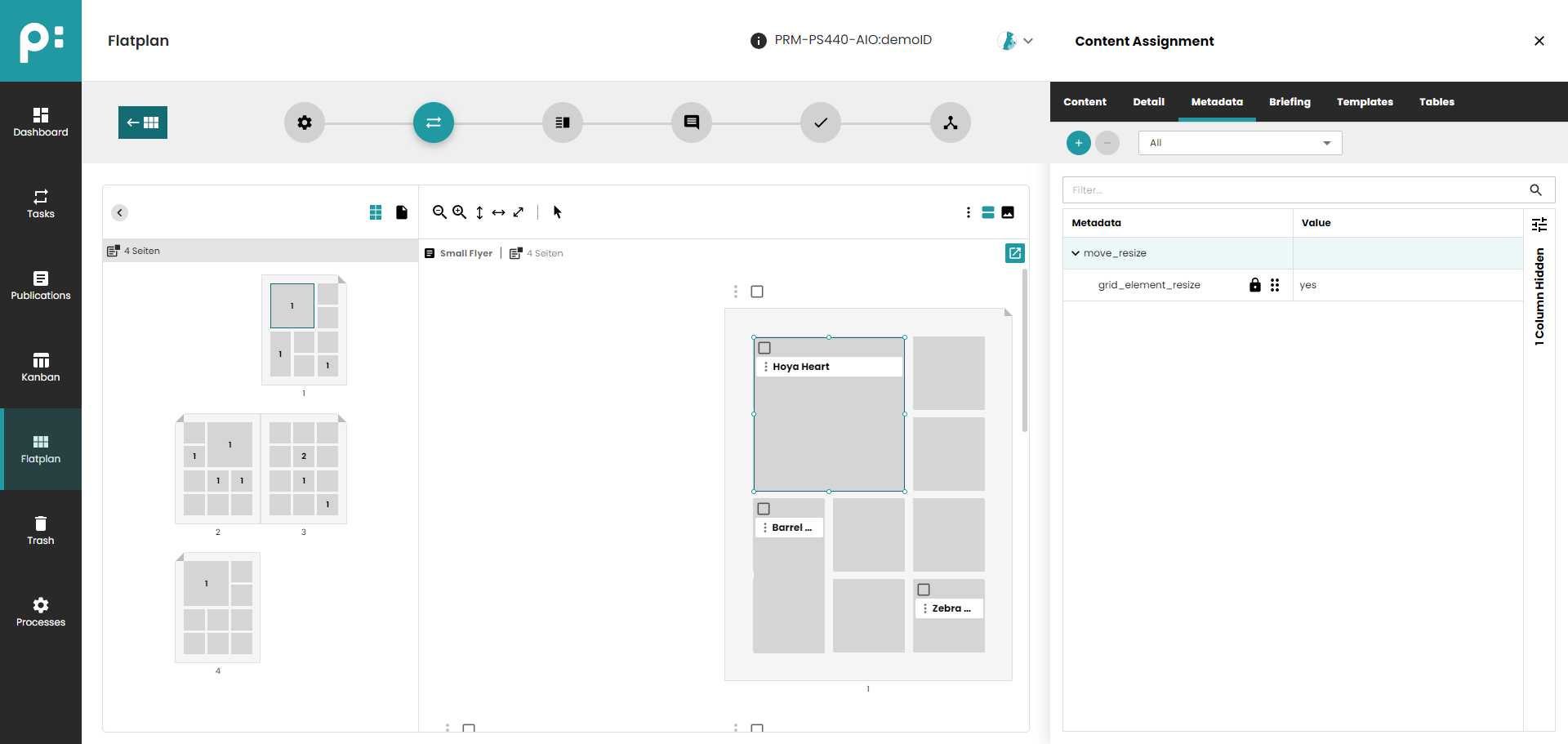
- Select a Grid Element or a Planning
- Select Tab "Metadata"
- Edit "Content Metadata" in Detail Panel
Important:
In Neowise Grid Planning only the ContentMetadata key "grid_element_resize" (entity "move_resize") is taken into account. The entity "content_creation" with it's keys and the other keys from the entity "move_resize" ("grid_element_overlapping" and "grid_element_move") known from "Layout Briefing" are ignored.
New Configuration that needs to be added to the Page Template is the Content Metadata Flag "grid=yes"
4.2.1.3 Assign/Change Page Grid in Basic Perspective
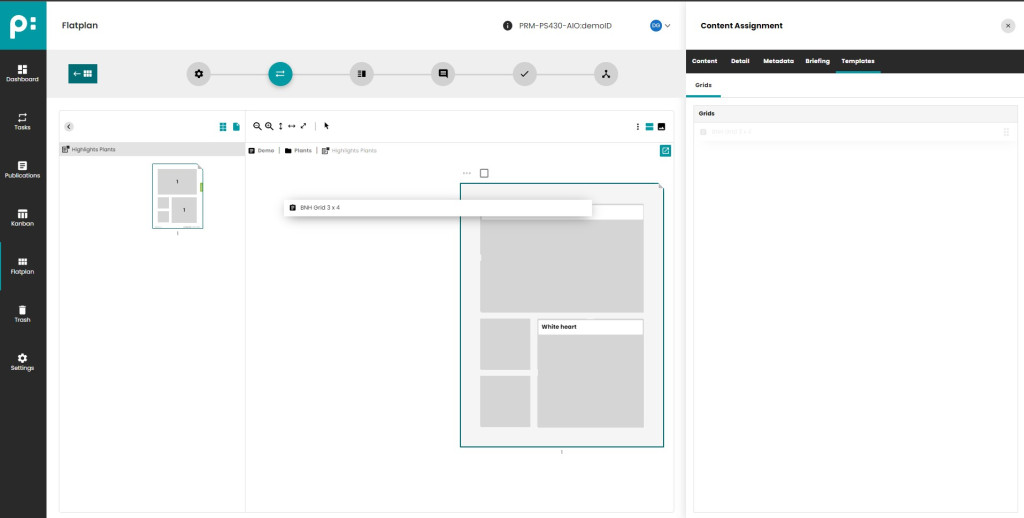
- Select a Page by clicking on the white space of a page
- Select Tab "Templates"
- Drag & Drop a Grid (Page Template with Content Metadata Flag "grid=yes") to the Page
- Already planned content will be planned again automatically based on Grid Element Index set in the Page Template Configuration in priint:comet
- If the new Grid has less Grid Elements than the previously set Grid all Plannings will be recreated on the last Grid Element
4.2.1.4 Smart Resizing of Grid Elements in Basic Perspective
- It is possible to Smart Resize Grid Elements by clicking and dragging the edges off a Grid Element
- If you cannot drag an edge, this is because there are already planned
4.2.1.5 Global Context Menu of Basic Perspective
- Single Page - all pages are displayed one under another (multiple page spreads are divided into pages);
- Double Page - standard view with double pages;
- Show Template - show the Product Template dropdown on each planning;
- Show Snippet - show the Product Snippet field on each planning;
- Show Image - show the main image of the Planning (if any);
- Show Image or Snippet preview - show the main image of the Planning or the preview of the Snippet (if any). If the Snippet is assigned, its preview will always be shown.
- Do not show anything (no preview will be displayed);
4.2.1.6 Edit Briefing of a Planning
A Briefing Information can be added to Planning and can be read when building the Content in priint:comet.
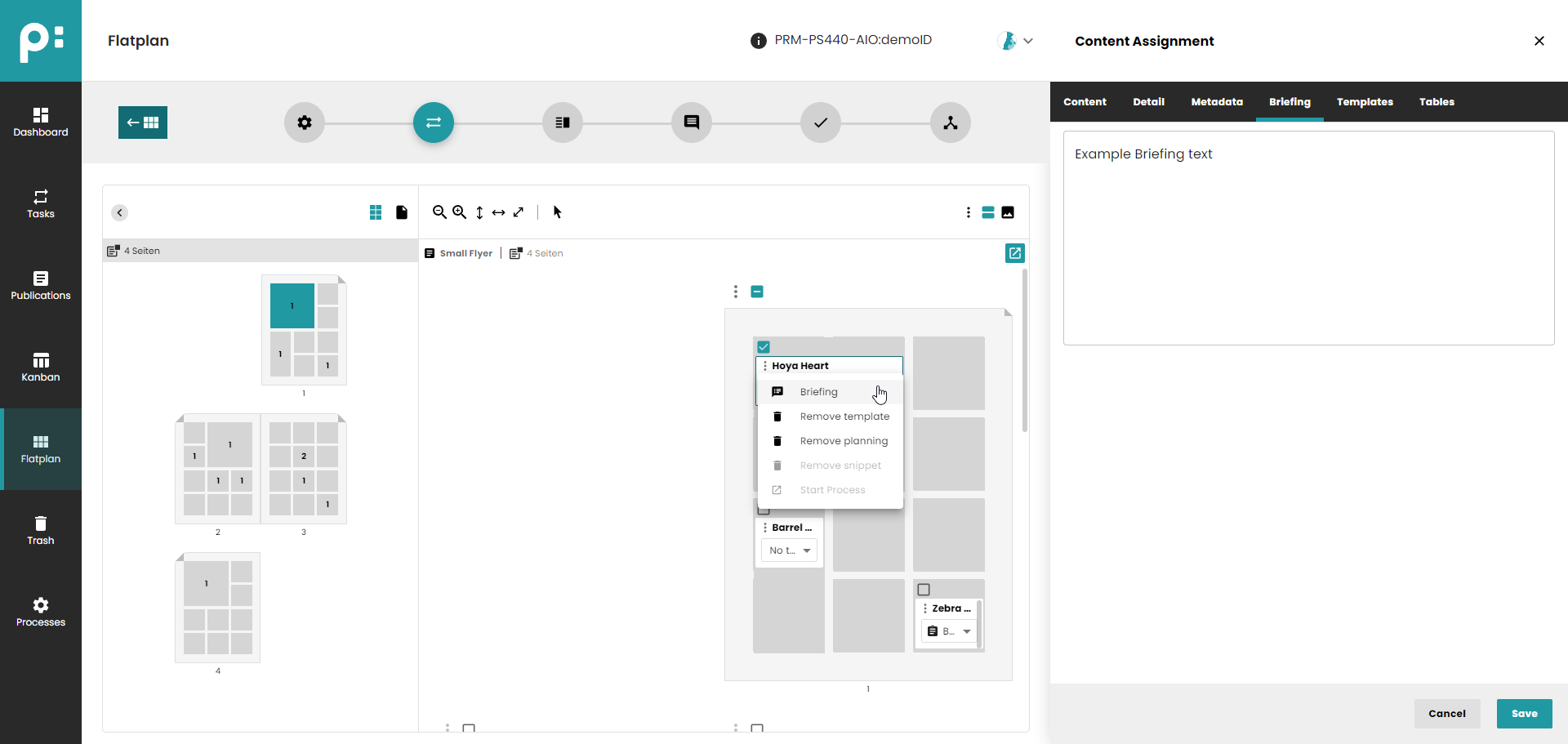
- To Edit the Briefing Information of a Planning first Select the Briefing Tab
- Click on the Planning - Edit Field will be filled with current value. You can now change this.
- It is also possible to use context menu of the Planning to turn on the Briefing Tab for this planning.
4.2.1.7 Delete Plannings in Basic Perspective
There are two ways to Delete Plannings.
- For multi0selection, you can use the Page Context Menu to delete/remove selected Plannings.
- For deleting a single planning, you can use the context menu of the Planning
4.2.1.8 Adding a bucket to a document with automatic resizing to a product template
To add a bucket with automatic resizing to the product template, select the product template using the checkbox and add the bucket by holding down the 'alt'/'option'* key. The Planning will grow to the size of the Product Template.
* 'alt' - for Windows, 'option' - for macOS.
4.2.1.9 Moving a planned bucket with automatic size adjustment
It is possible to move the planning so that it retains the dimensions of the Real Grid Element from which the planning was moved. To achieve this, please hold down the 'alt'/'options'* key and move the planning. The Real Grid Element will be adjusted to the dimension of the Real Grid Element from which the planning was moved. These dimensions will adjust relative to the right/bottom edge. Only expansion of elements is supported (if the destination Real Grid Element is bigger, its size won't be reduced).
* 'alt' - for Windows, 'option' - for macOS.
4.2.2 Print Perspective
In the Print Perspective of the Content Assignment Stage the User can see the rendered Result of planned Content in a Grid based on priint:comet Product Templates.
4.2.2.1 Render all Grids on a Page
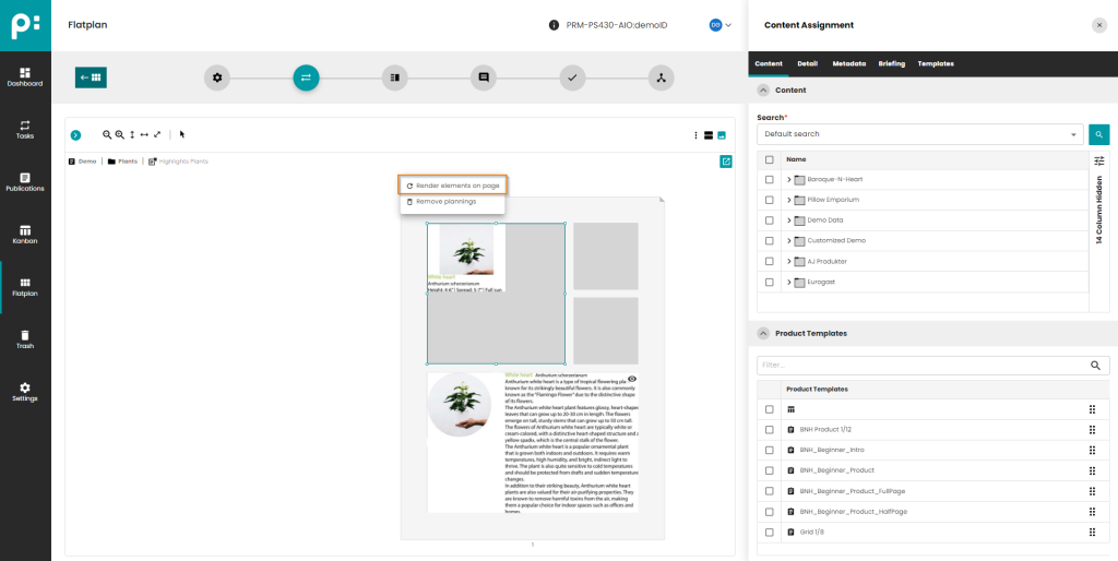
- To Render all Grids on a Page use the Context Menu of the Page and select "Render elements on page"
4.2.2.2 Render a Grid
- To Render a single Grid use the Context Menu of the Grid and select "Render"
4.2.2.3 Handling of Over-Sized Grid Element Previews
- The User of the Print Perspective of Grid Planning needs to be able to see the whole Preview of the planned Content, even if it does not fit inside the Grid Element
- If the Preview is larger than the Grid Element, the top left part of the Preview is shown, and additionally an eye-icon in the top right corner of the Element is shown. If the User clicks on the Icon, the whole Preview is shown as an overlay.
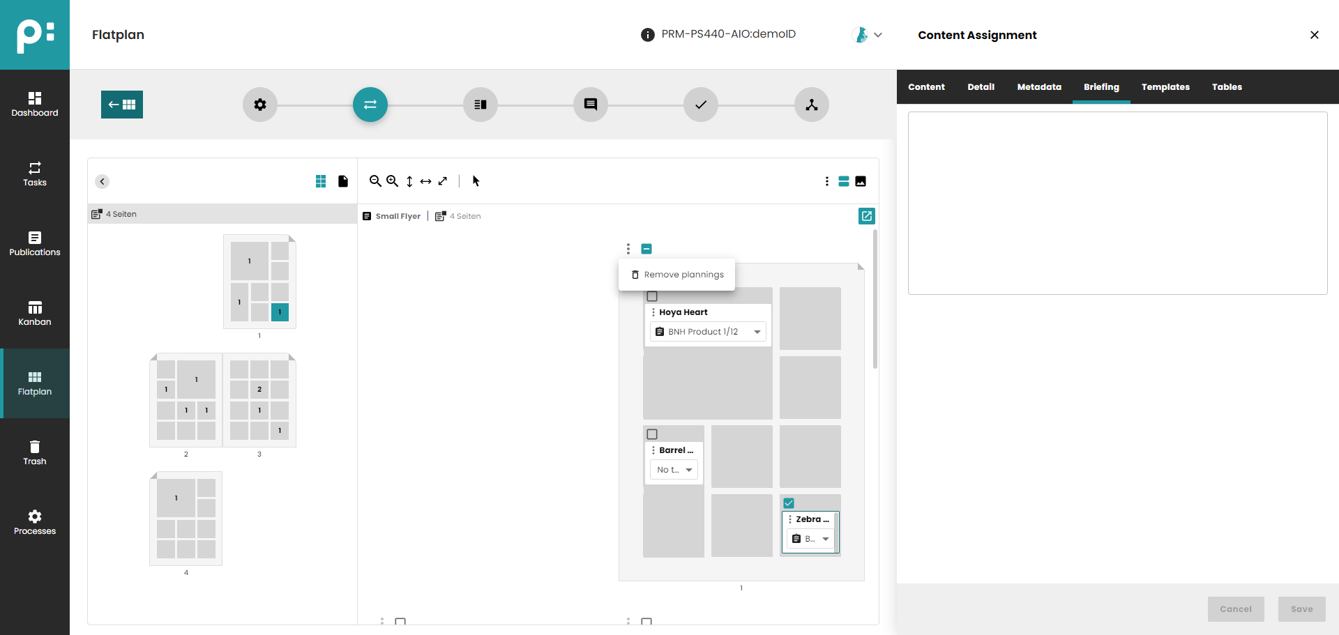
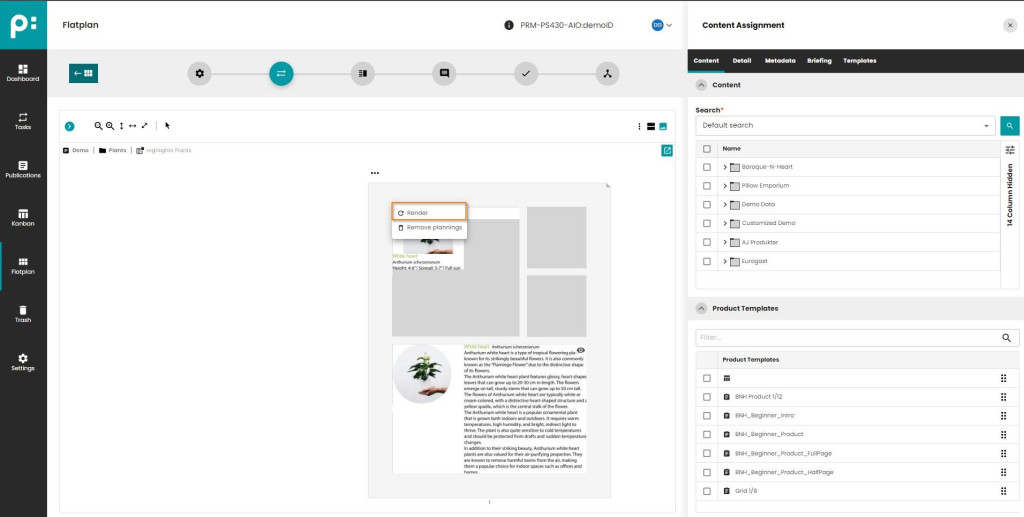
4.2.2.4 Remove all Plannings of a Page and Re-Render

- To Remove all Plannings of a Page, use the Page Context Menu and select "Remove plannings"
4.2.2.4 Remove all Plannings of a Grid and Re-Render
- To Remove all Plannings of a Grid, use the Grid Context Menu and select "Remove plannings"
4.2.2.6 Selection of single Planning in Print Perspective
Important: It is not possible to select a single Planning in Print Perspective. All Tabs (e.g. Briefing) which need a single Planning selected will not work. Use the "Basic Perspective" to do this work.
4.2.2.7 Global Context Menu of Print Perspective
- Single Page - all pages are displayed one under another (multiple page spreads are divided into pages);
- Double Page - standard view with double pages;
- Render selected elements - render selected Real Grid Elements (active only if some Real Grid Elements are selected);
- Render selected elements - render all Real Grid Elements for the document;
4.2.2.8 Change Grid Element Preview Process and Grid Preview Script for rendering
- As a Default all "Grid Element Previews" for all Projects are created using the Standard Camunda Process "P003_Render_Grid_Element_Preview" which uses the Standard Script (ID 1017) in the Service Task "Render Grid Element Preview" to create the Grid Element Preview.
- This behaviour can be customised.
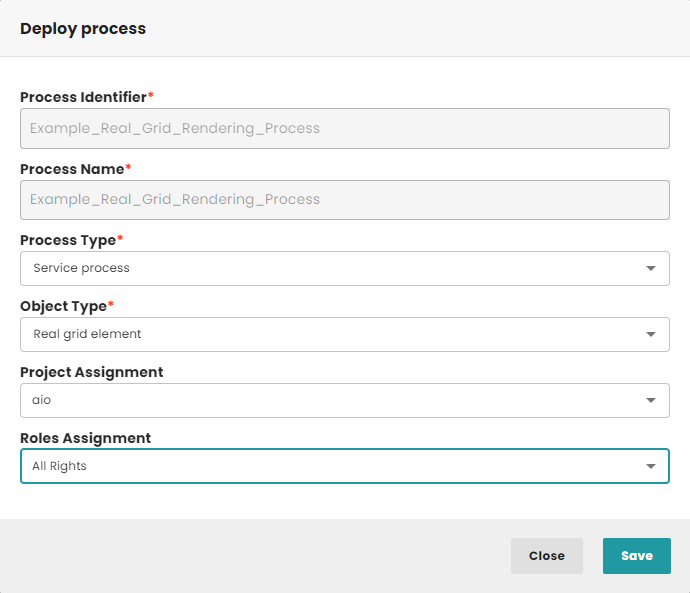
- To use another Camunda Process, first create this Process based on the Standard "Grid Element Preview" Process (P003_Render_Grid_Element_Preview available in the Camunda Cockpit) and change its flow if needed.
- After creation, deploy the Process using Settings -> Deployed Processes
-
- "Process Identifier" should show the Identifier of your newly created Process
- "Process Name" should show the Name of your newly created Process
- "Process Type" has to be set to "Grid element preview process"
- "Object Type" has to be set to "Real Grid Element"
- "Stages Assignment" has to be set to "Content Assignment", all other values are invalid here.
- "Project Assignment" can be set to all Projects (set it to "empty") or to the desired Projects where you want to use this Process for Grid Element Preview Generation
- "Roles Assignment" - Select the Roles for which this Process should be available
- The Fallback is always the Standard Process with the Standard Script 1017.
- "Process Identifier" should show the Identifier of your newly created Process
-
To change the used Preview Generation Script add the Variable "scriptId" to the Service Task "Render Grid Element Preview" and set the correct value.
4.3 Uploaded Documents
Manually created documents can be uploaded into Neowise by using the context menu entry "Upload Document" in the Publication Window.
- Uploaded documents are handled differently as other documents. The Document Stages "Content Assignment" and "Preparation", are not needed.
- For being able to recognize this they have a different document type, Uploaded and a different icon
 .
. - Flatplan Preparation is not available for "Uploaded Documents".
- Flatplan Content Assignment is not available for "Uploaded Documents".
- When a document is uploaded, the stage is set to "Layout" automatically. The buttons for setting the stage to "Content Assignment"and "Preparation" are disabled.
- If by any way the Content Assignment stage is opened for a Uploaded document, the stage just shows an info message “Content Assignment is not available for Uploaded documents”
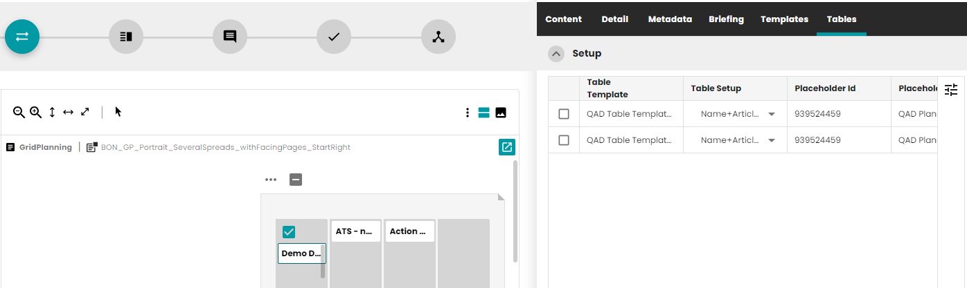
4.4 Tables Module Tab
4.4.1 Introduction
Tables are widely used in publishing for generating table content. Very often different tables have to be configured for each document or planning. To make the process faster and more user-friendly, the Table Module is available in Neowise.
There are 3 ways to configure tables in priint:suite.
- Data mapping method with a config file
- Data mapping method which is configured by the content meta data of the planning record
- Mixture of both strategies
Throughout the document, the following terminology will be used:
- Table template This is a data mapping method which is annotated. This data mapping method has a config file. In this config file, different configurations of the data mapping method can be used. It is necessary for the config file to contain minimum one configuration. Optionally: In each config, it can be defined which content meta data are used. Note: This is not the old table template from comet desktop plugins.
- Table setup Link to configuration inside the config file of the data-mapping method.
- Table Configuration of a table for a planning record. This configuration is done by the content meta data of the planning record.
The creation and configuration of Table templates is described on How-To Create and Use Table Templates and how to convert TableData to HTML is available on Converting TableData to HTML.
This document describes how to use the Table Module for already configured Templates in Neowise/Ison.
4.4.2 User Interface
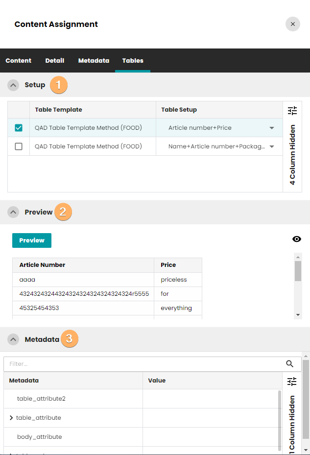
Table module table is divided into tree sections:
- Setup
- Preview
- Metadata
4.4.3 Setup
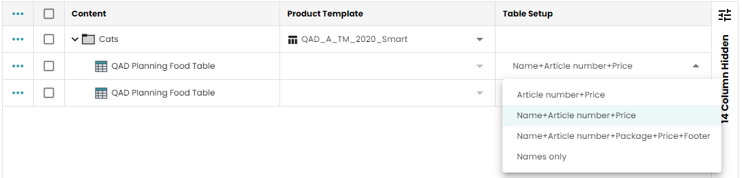
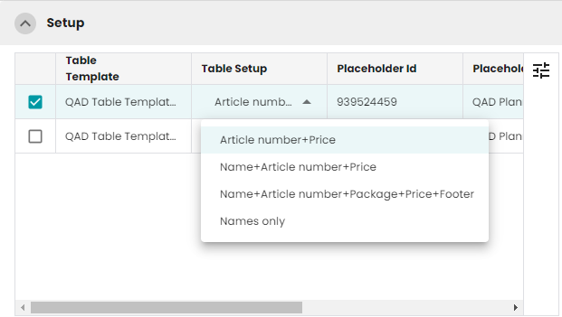
This component shows the table sub-plannings, their setups and placeholder (some columns are hidden). The User can change the Table Setup and select the table sub-plannings.

The following columns can be shown:
- table template - name of the template
- table setup - selected table setup
- placeholder id - placeholder id
- placeholder uid - placeholder uid
- placeholder- placeholder name
- table - selected table type/name
4.4.4 Table preview
For each table sub-planning, it is possible to generate HTML preview of the configured table. After changing content metadata or setups, the user can quickly check the result of the changes by clicking the Preview button.
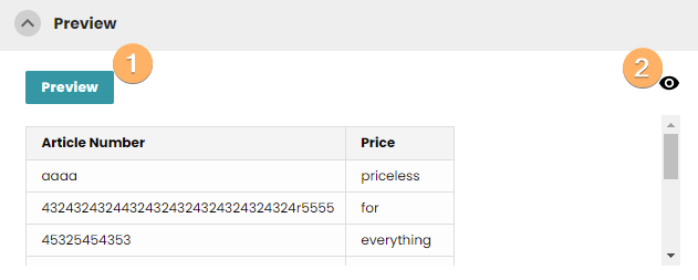
Available buttons:
- Generating table preview on-demand
- Fullscreen mode of table preview
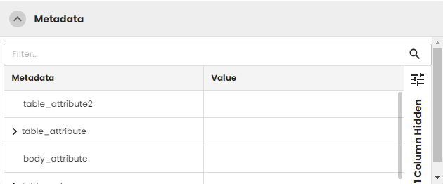
4.4.5 Content Metadata
This component allows the user to quickly edit the existing content metadata for table sub-plannings. It is possible to change the Key (after clicking the lock button) and the value.
Note:
When user will change the table setup, current content metadata is compared against the default content metadata (from user's plugin). It checks the keys in the current content metadata and if the same key exists in the default metadata, it checks its value. When the values are different the below Dialog will be shown:
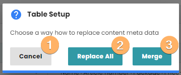
- Cancel the operation and close the dialog
- Replace all current content metadata with default ones and change table setup
- Preserve changed values and change table setup.
4.4.6 Plannings
After assigning a Product Template, table sub-plannings are created. The number of the sub-plannings reflects the number of the configured Tables for the Template. This feature works for Dynamic and Static documents. Additionally, in Planning with Dynamic Document new columns related to Tables were introduced (the same columns exists in Tables Tab). A column Table Setup is editable and the user can change configuration without going to Tables Tab.
4.4.7 Choosing Table Setup
Each Table Template can contain multiple Table Setups. Each setup can trigger a different table preview.
First table setup can look like:
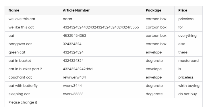
Whereas second table setup can generate the following output:
4.5 Snippets
Snippets are a re-usage of a finished part of an InDesign layout. They are based on comet groups and can contain a comet placeholder. Snippets contain the information from the source documents. They can be created in the preview panel of comet InDesign plugins or via script commands on InDesign desktop/ InDesign server.
Snippets panel is available in Flatplan Content Assignment stage. The panel is displayed for documents with the parameter _snippet set to true.
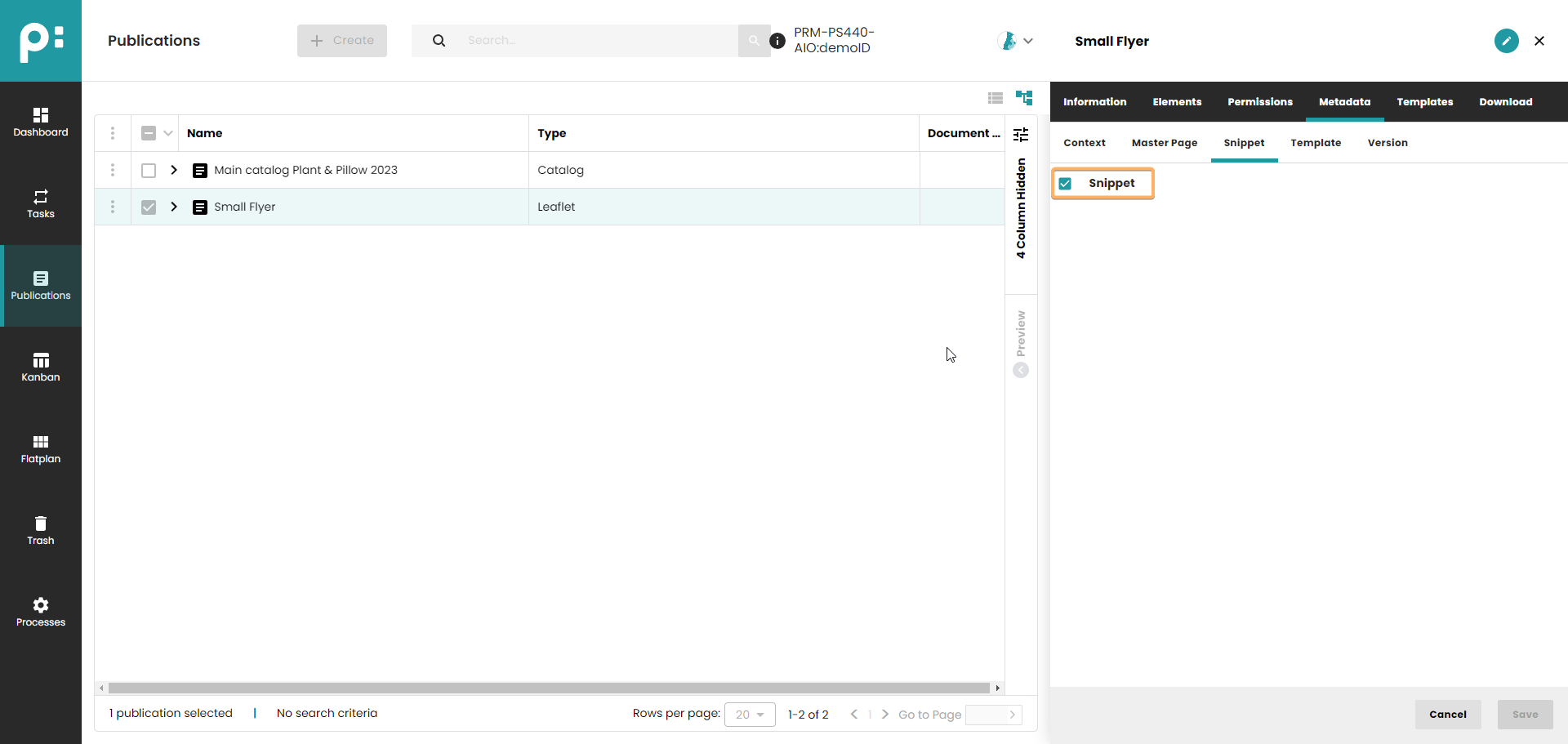
The panel can be found below the Product Template panel in Grid and List Planning.
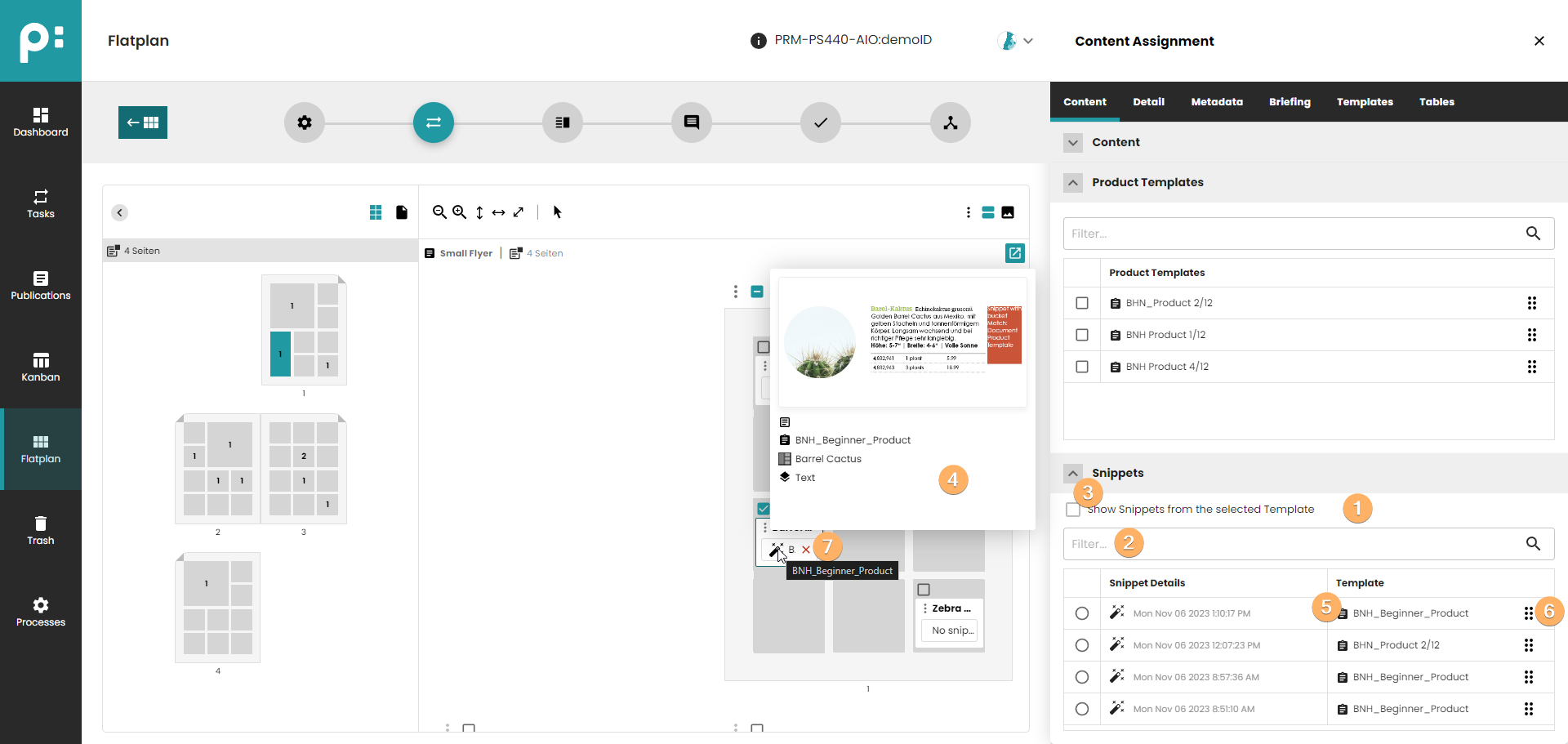
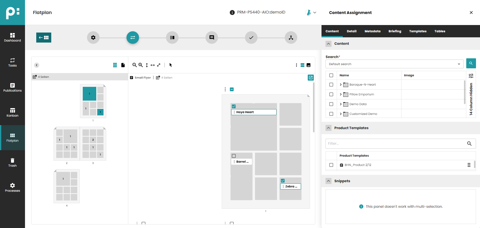
- Snippet list is displayed based on the selection of the Planning or Bucket. Multi-selection (also between the same type) is not supported.
- Filtering by the source is possible.
- Filtering by selected Product Template is possible after enabling this option.
- Preview of the Snippet can be shown after hovering over the Snippet icon
 both in the Snippet list or in the Planning.
 - Preview of the source Product Template can be shown after hovering over the Template icon.
- Snippets can be assigned by drag and drop. If a Product Template was previously assigned to the Planning, the template assignment will be removed.
- Snippet assignment can be removed using the X icon in the Planning or using the context menu command Remove Snippet.
In Grid Planning, the user must enable the Show Snippet option in the view options to see the Snippet assigned to the Planning (the setting is saved for future sessions of this user).
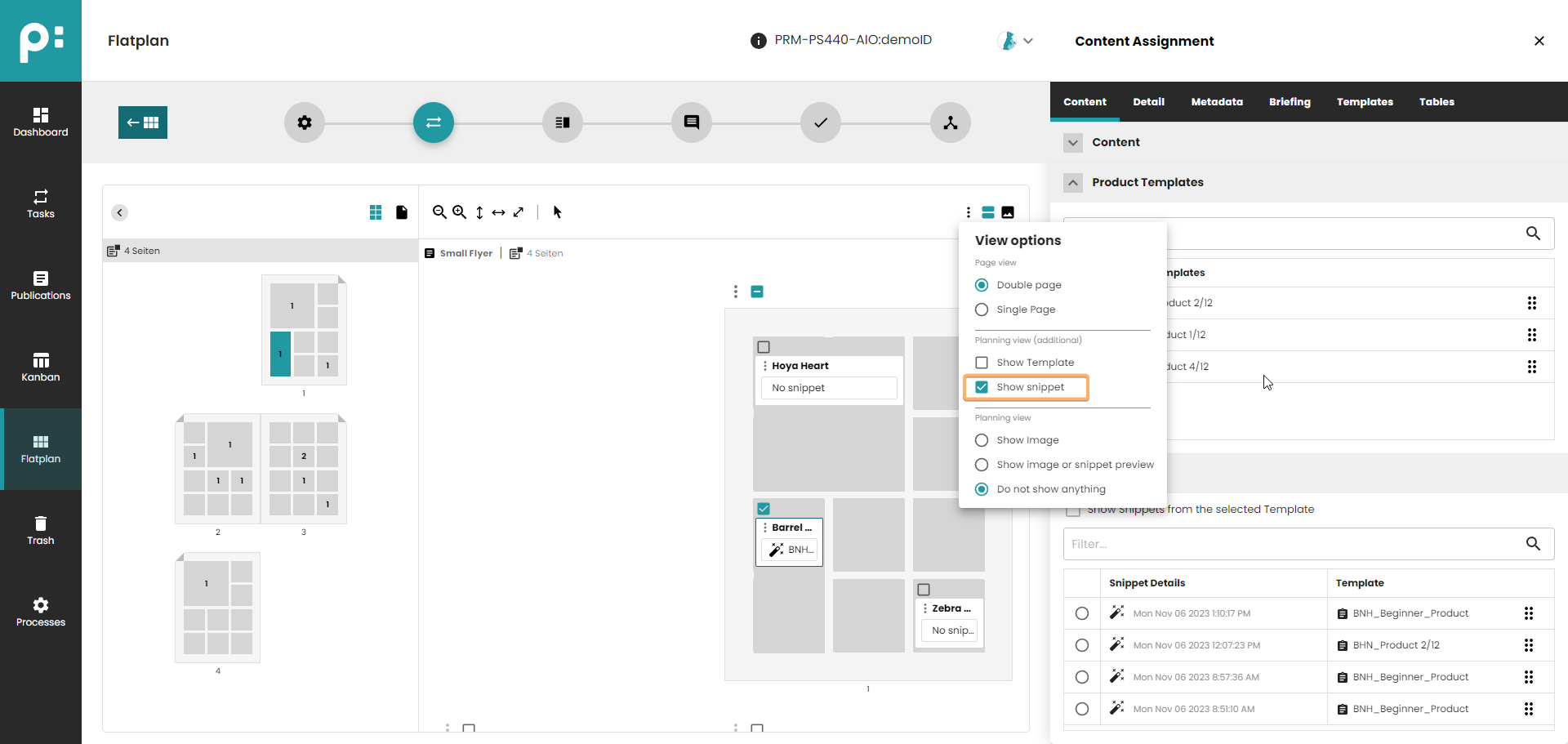
In Grid Planning, the user can also decide to display the preview of the snippet directly in the Planning using Show image or snippet preview view option. If the Planning doesn't have an assigned Snippet, the main image will be displayed.

In List Planning, the user must enable the Product Snippet column to see the assigned Product Snippet (the setting is saved for future sessions of this user).
5 Flatplan Layout Stage
The Layout stage is mainly used for manual layout work, in Adobe InDesign. The Flatplan can be used for visualization of the work progress for the users without Adobe InDesign.
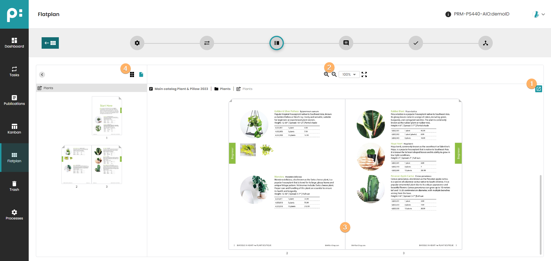
- It is possible to start a process for the document.
- The zoom control allows the user to check the document in detail.
- The middle pane shows the pages.
- Page elements can be shown or hidden depending on the needs.
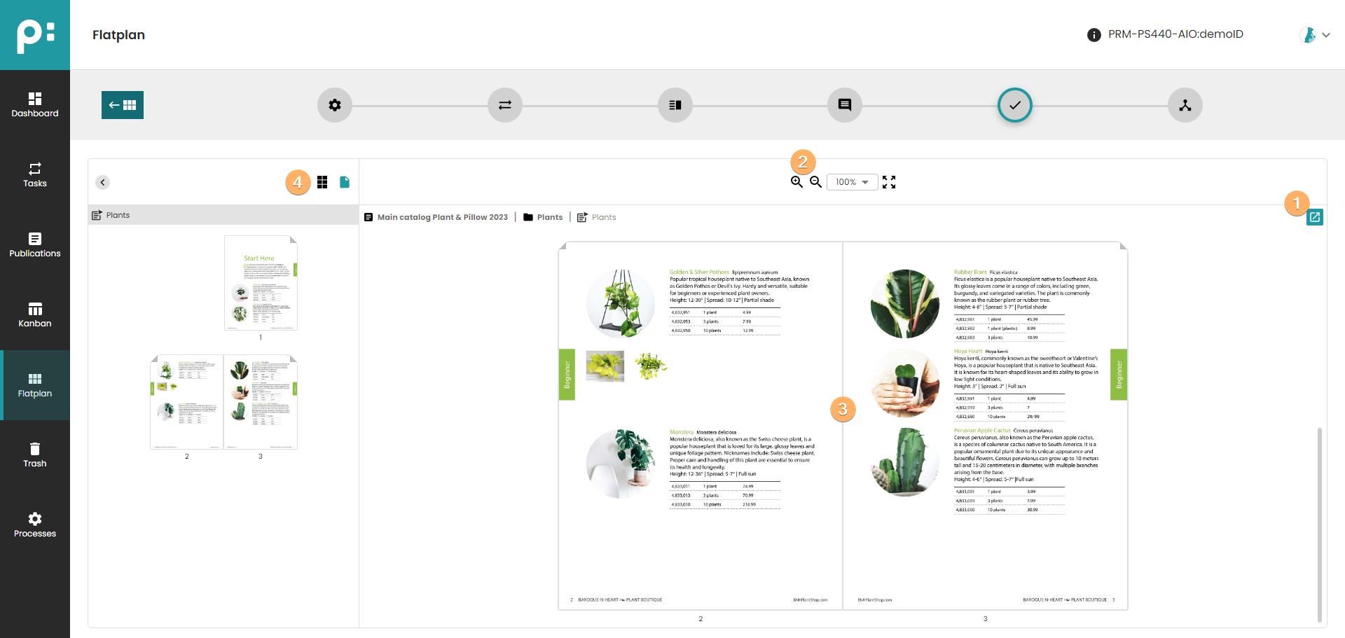
6 Flatplan Review Stage
The Review stage is used for the collaborative process for review and corrections. In the middle pane, the current pages are displayed. The zoom control allows the user to check the document in detail.
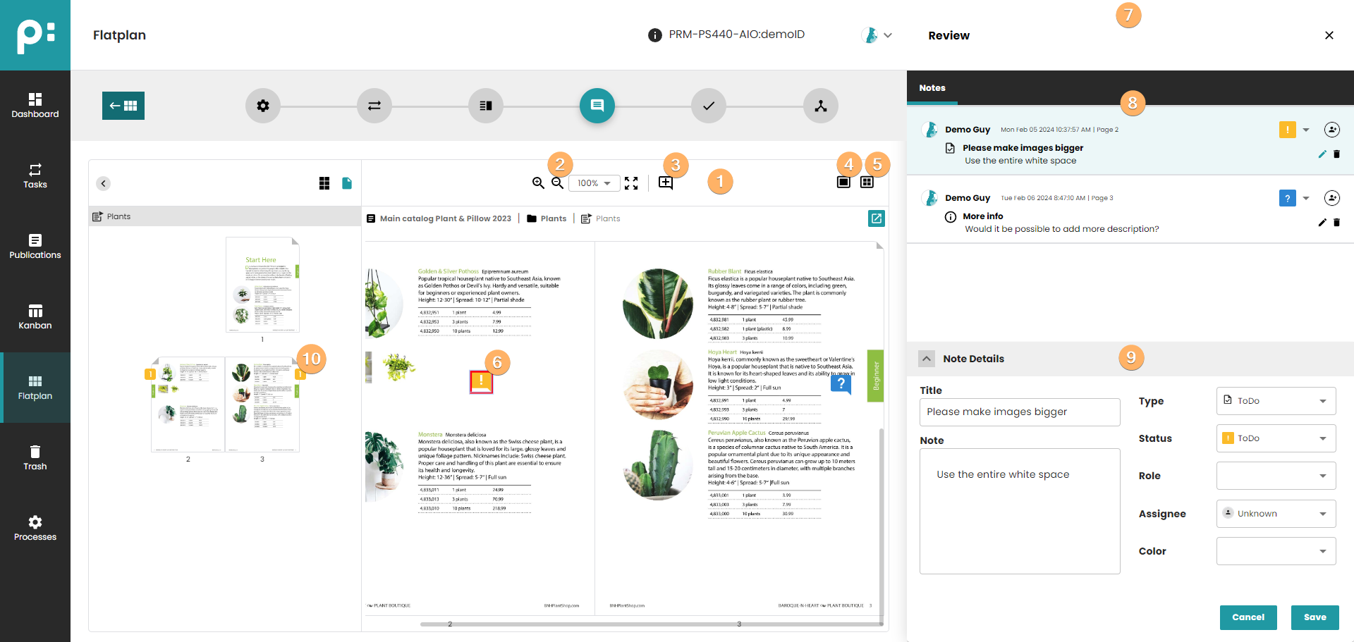
- The middle pane shows the pages.
- The zoom control allows the user to check the document in detail.
- Add a note by dragging
 to the correct position on the page, or by right clicking on the page, and choosing Add note.
 - Toggle display of comet groups.
- Toggle display of frames.
- Select a note by clicking on its symbol. The symbol visualizes the status of the note,
 =ToDo,
  =Request, and
  =Okay. Right click the note for deleting it.
 - The notes panel for editing notes.
- The upper part of the panel lists all notes in document.
- The lower part of the panel shows the details of the selected note. Here the user can edit all fields of the note, and save or cancel the changes.
- The number of notes for a given page can be seen on the overview on the left hand side.
7 Flatplan Finishing Stage
In the Finishing stage final changes are done to the document, like updating prices. For this the Start process button should be used.
- It is possible to start a process for the document.
- The zoom control allows the user to check the document in detail.
- The middle pane shows the pages.
- Page elements can be shown or hidden depending on the needs.
8 Flatplan Delivery Stage
In the Delivery stage PDFs are created and downloaded. The creation of the PDFs and preparing them for downloading is done by executing a download process. There are standard processes, but also custom processes can be created and used here. It is important to understand, that the download process only prepares the downloads. The preparation might consume a notable time, depending on the size of the document, number of images in it etc. The process will not download its result to the user’s computer. This last step must be done in the Delivery stage tool panel. The user can select the resulting archives of every download process started for the current document here.
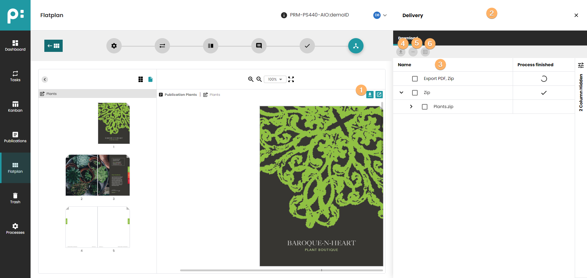
- Button for starting a download process.
- Delivery stage tool panel.
- Tree list of all executed download processes for the current document.
- If a Zip or other archive file is selected, this download button will download the file to the user's computer.
- If a result set is selected, this delete button will delete the result set from the server including all generated files.
- If a download process created a report file, its content will be displayed.